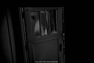
Inspired By: Irving Penn
Monday, December 11, 2017
Wednesday, November 29, 2017
Assignment #15 - Light...When Its Right It's Right
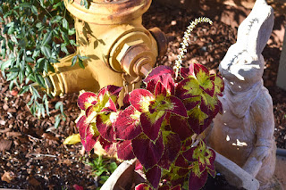
Focal Length: 48.00 mm; Exposure: 1/250; F/Stop: 5.6; ISO: 220
When I put this photo in Lightroom I just enhanced the highlights and decreased the shadow and made it darker.
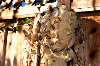
Focal Length: 55mm; Exposure: 1/200; F/Stop: 9; ISO: 100
For this photo as well when i put it into Lightroom I enhanced the highlights and decreased the shadows to make the image appear darker on one side.
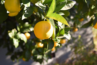
Focal Length: 48mm; Exposure: 1/250 sec; F/Stop: 5.6; ISO: 220
For this photo I made four edits in Lightroom where I made the white and highlights lighter and made the shadow and blacks appear darker.
Sunday, November 26, 2017
Monday, November 20, 2017
Assignment 20 - Its so Surreal!
By: Anna McNaught
By: Mattie Brass
When I first looked at the surreal photograph by Anna McNaught I fell in love with it. I loved the idea of capturing a woman looking out into the universe instead of what you would normally see like clouds and land. The second photograph I loved the more I studied it. The more and more I looked at it all the lines seemed to blend together and I fell in love with the idea.
When I first looked at the surreal photograph by Anna McNaught I fell in love with it. I loved the idea of capturing a woman looking out into the universe instead of what you would normally see like clouds and land. The second photograph I loved the more I studied it. The more and more I looked at it all the lines seemed to blend together and I fell in love with the idea.
Tuesday, November 14, 2017
Assignment #18 - Will The Real Aaron Siskind Please Stand Up?
What inspired me the most while looking at Aaron Siskind's work was how he saw something super simple like a pattern or an objected and captured it in it's most simplest form. But when he edited the photo's and made them black and white they sort of became a more interesting like theres this whole new story behind them. I wanted to do the same so I looked around for simple objects or patterns and this is what I found.
Tuesday, November 7, 2017
Thursday, November 2, 2017
Tuesday, October 24, 2017
Wednesday, October 18, 2017
Assignment #13 - Teresa Halton Posting
 Exposure: 1/250 sec; f/8; ISO 1600.
My F-stop was at a good setting because it balanced the amount of sunlight and focused the picture perfectly.
 Exposure: 1/60 sec; f/4.5; ISO 1600
In order for this picture to turn out better I would've needed to change my f-stop to be f/22 to control the amount of sunlight in the photo and lower my ISO to be from 100-200 so that it's more sensitive to the amount of light that was let in.
Monday, October 9, 2017
Thursday, October 5, 2017
Tuesday, October 3, 2017
Wednesday, September 27, 2017
Assignment #6 - Polar Opposites
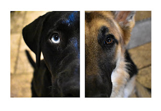
A huge list of ideas come to my head when I think of polar opposites. Fire and ice, black and white, happy and sad, etc. But one that stuck out to me was boy and girl. Boys and girls are complete opposites of each other and I wanted to come up with a way to show that. I thought about doing a picture of a guy and girl doing something or dressed a certain way but everything I thought of didn’t sound good. I had my dogs with me while I was thinking of ways to portray polar opposites when It hit me. My dogs are opposite genders and different breeds. I wanted to some how capture the different breeds so I decided to take a picture of there faces and crop them in half and put them side by side. My dog luna is half husky half black lab so she has one blue eye and one brown. Since my other dog Capo, who is a german shepherd has two brown eyes I thought it would be unique to crop Luna’s brown eye out and accentuate her blue eye. I put the photo in lightroom and brighten her eye a bit. I also put the picture of capo in and made his fur and eye a little more clear. When i finished touching the photos up, I put them in photoshop and put them side by side and I thought It turned out really great. Even though it wasn’t my original idea of having a boy and a girl, I’m very happy with this idea instead because I thought It came out great.
Thursday, September 21, 2017
Assignment #7 - What Color Are You?
When you meet me you quickly learn that soccer runs my life, in a good way of course. I have some what of a hard exterior and i'm not someone who is very open. But once you get to know me you know that I'm a huge softy. The color and image of the photo I captured represents my interior. The part of me people don't see.
Friday, September 15, 2017
Wednesday, September 13, 2017
Assignment #4 - Composition
 Fill The Frame
I feel that this picture I have taken has great composition because it captures the simplicity of nature and draws you in.
 Leading Lines
 Background
 Avoid The Middle
We tend to take pictures and place of main object in the center so when I was taking this I wanted to focus my subject of to the side and wanted to make it a candid photo so that it didn't seem like it was planned.
 Simplify The Scene
This picture too has great composition as well because I took my dog and and captured her in her most simplest form.
Monday, September 11, 2017
Thursday, September 7, 2017
Subscribe to:
Posts (Atom)
-
David Hockney is an England born man who is most famous for his paintings of pools. He moved to Los A...


